Bareli branding
- Role
- Brand identity designer
- Year
- 2025
- Client
- Bareli
- Scope
- Logo and wordmark, Colour and type, Rice and honey packaging, Out-of-home, Vehicle livery, Signage, Logofolio
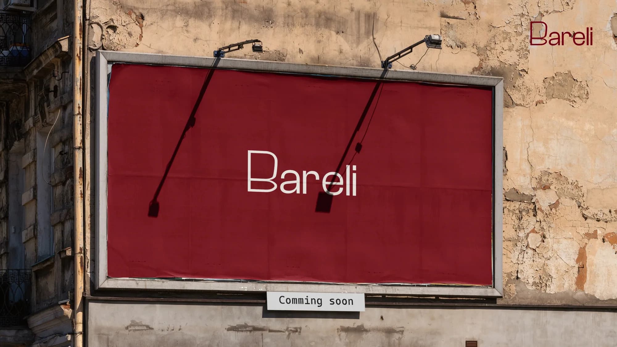
Bareli offers export-grade rice and honey, held to international standards and made accessible at home. Rooted in purity and built on trust, it blends tradition with modern excellence. I designed its identity, from the wordmark and palette to packaging, signage and a delivery van.
Context
At Bareli, exceptional quality shouldn’t be limited to export markets. Its export-grade rice and honey, carefully crafted and held to the highest international standards, are now made accessible at home. From fertile fields to the table, every product reflects a promise of clean, honest, premium food.
Bareli Rice is long-grain Basmati from the fields of Pakistan, naturally aged and carefully processed. Bareli Honey is raw, pure and unfiltered, harvested from natural floral sources and bottled with care.
The mark
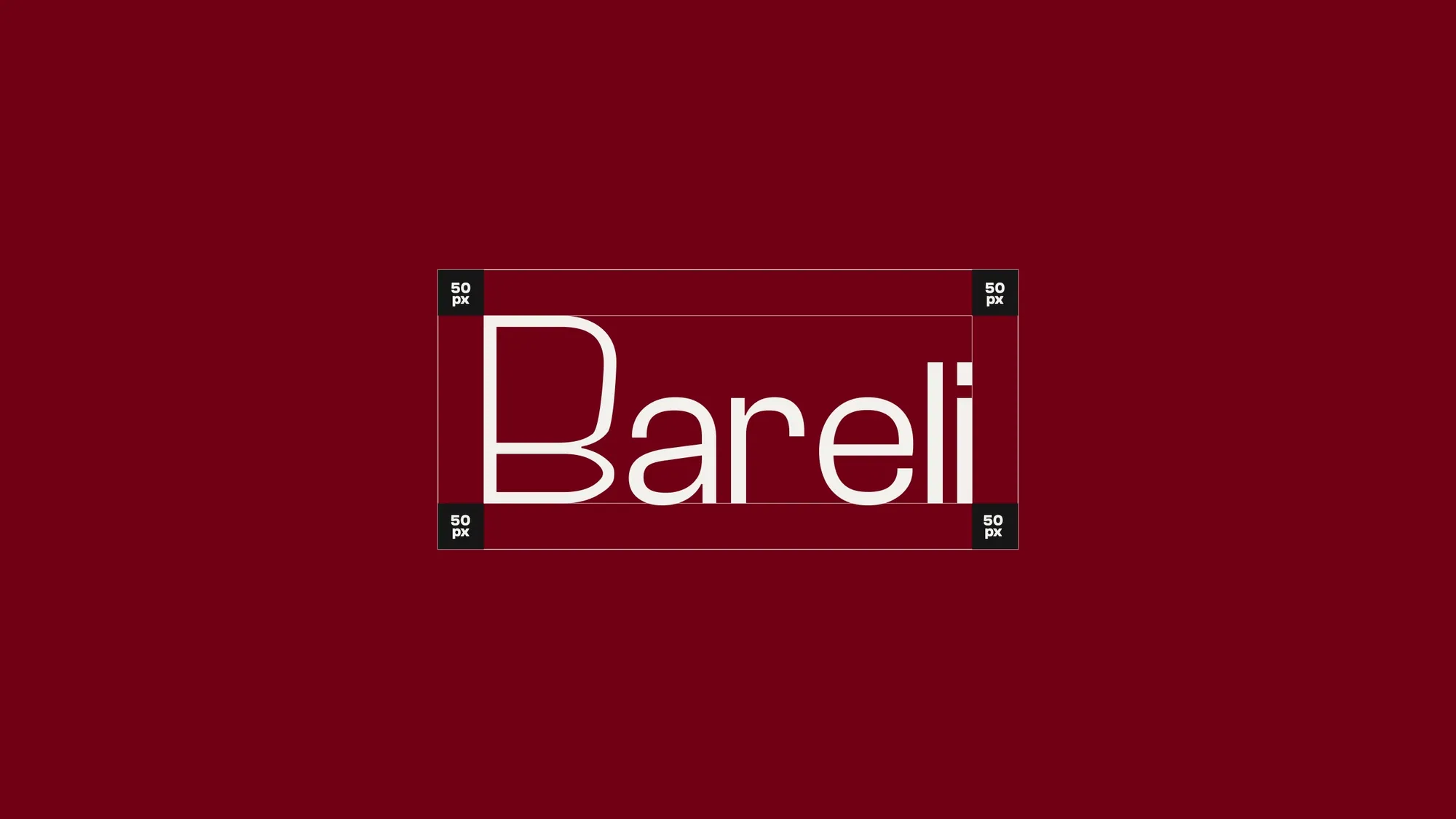
A clean, modern wordmark with a softened, rounded B, built on a grid, and a monogram from the same B for small spaces. It sits in cream on a deep red, or in red on cream.
Colour and type
A deep red leads, with black, cream and a warm tan. Clash Grotesk sets the headlines.
- Deep red#710014
- Black#161616
- Cream#F2F1ED
- Tan#B38F6F