Vimersive Studio
- Role
- Brand identity and web design
- Year
- 2025
- Client
- Vimersive Studio
- Scope
- Logo and wordmark, Logo explorations, Colour and type, Website design, Showreel edit
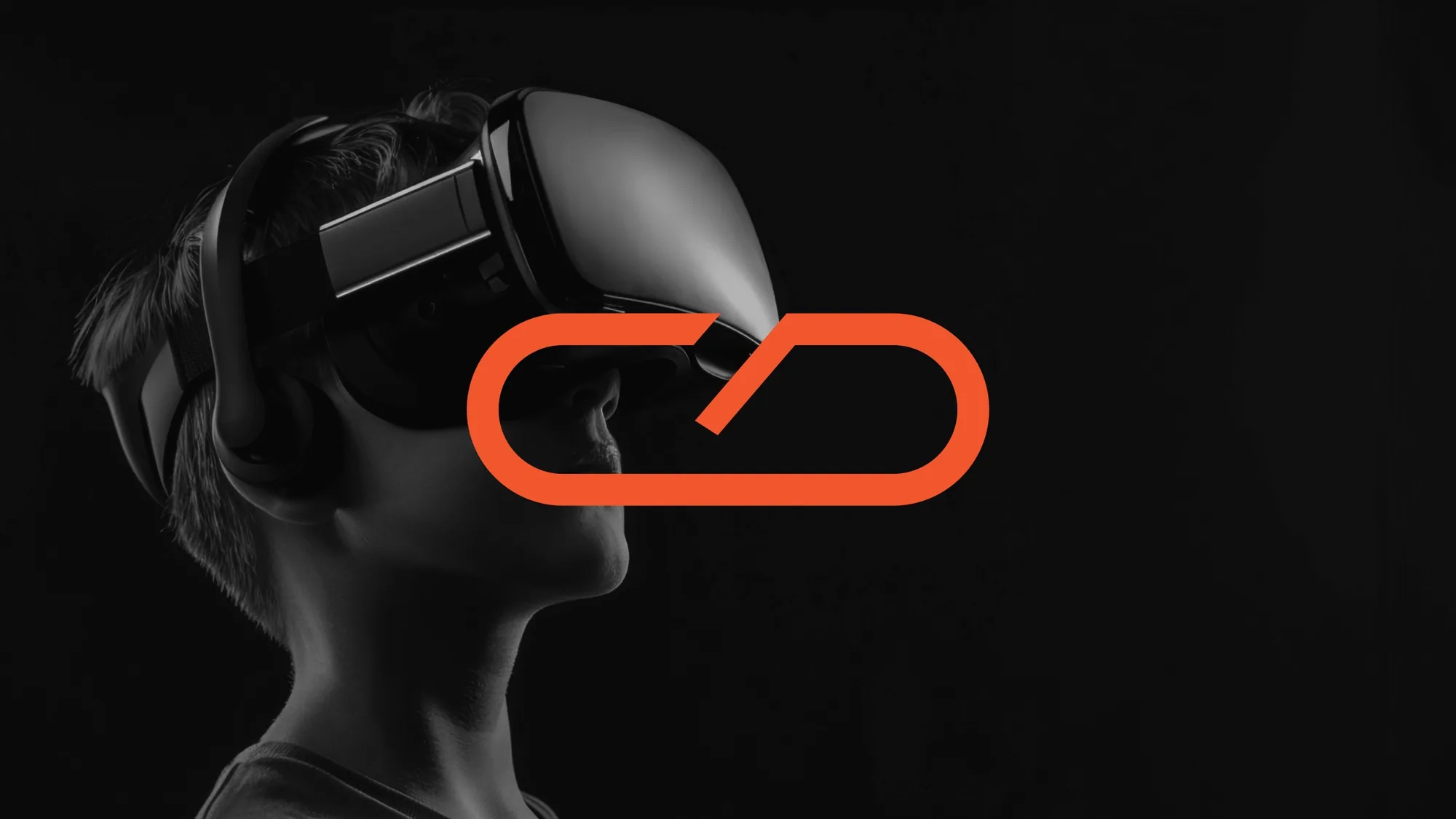
Brand identity and website design for Vimersive Studio, which builds immersive VR worlds, from games and simulators to training apps. The mark takes its shape from a VR headset, and the site carries it in black, grey and two warm reds. I also edited the studio’s showreel.
Context
Vimersive Studio creates immersive VR worlds that feel alive, from games and simulators to training apps, for industries including real estate, healthcare and education. Its services run from virtual reality experiences and AR apps and games to 3D game development, mixed reality and AI-enhanced experiences.
The mark
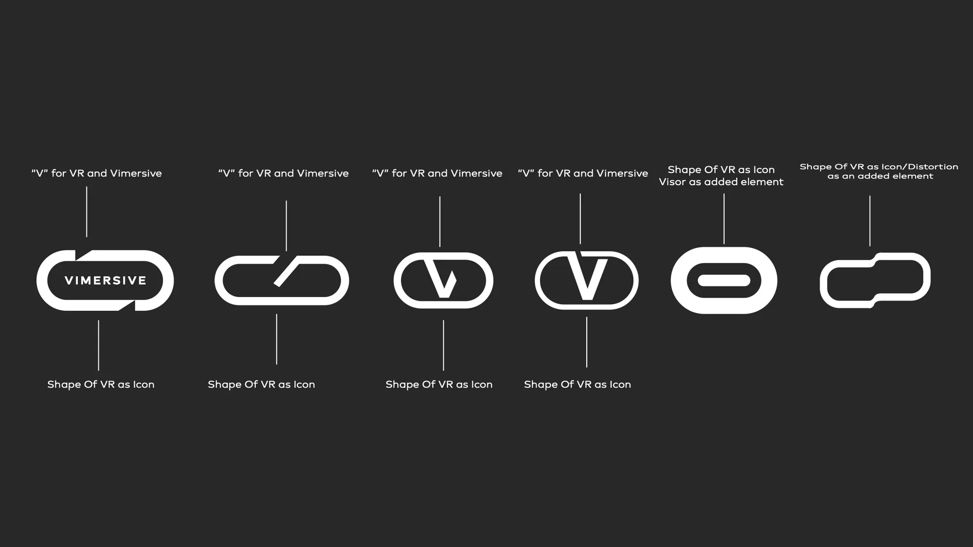
I explored the mark in several directions: a V for VR and for Vimersive, the outline of a VR headset as the icon, and the visor or a distortion as an added element. The final mark draws the headset as a single rounded outline, cut by one diagonal stroke.
Explorations
Colour and type
Black and grey set a dark, cinematic ground for orange and a deeper red, which carry the mark and the gradients. Brooklyn is the brand typeface.
- Black#000000
- Grey#646464
- Orange#F2562D
- Red#BA271C
The website
A dark, cinematic site that lets the studio’s worlds do the talking: industries, work in action, who the studio is and what it builds.