DIIC brand identity
- Role
- Research artist, graphic and brand design
- Year
- 2025
- Client
- CHISEL Human-Computer Interaction Lab, LUMS
- Scope
- Logo and wordmark, Logo explorations, Construction, Typeface, Colour palette, Stationery and ID, Signage and out-of-home
Brand identity for the Disability Inclusion and Innovation Centre, proposed at the CHISEL Human-Computer Interaction Lab at LUMS as Pakistan’s first hub for accessibility and human-centred innovation. The mark turns the centre’s two I’s into a person, and a die.
The brief
The centre was proposed to bring technology, co-creation and inclusive design together for people with disabilities in Pakistan, with a focus on the physical, cognitive and emotional sides of mental health. It would serve children, adults and older people, build and test low-cost assistive technology, and train students, professionals and researchers in inclusive design.
There is little research on disability in Pakistan: estimates of how many people live with one range from 3.3 million to 27 million. The centre’s case rests on that gap.
The identity had to feel authoritative, modern and human-centred in every application, and stay legible and approachable for the people the centre serves, from a business card to a shopfront.
I worked at CHISEL as a Research Artist (Graphic & Brand Design) on contract from July to December 2025, and designed the identity: the mark, its explorations and construction, the typeface, colour and applications.
The mark
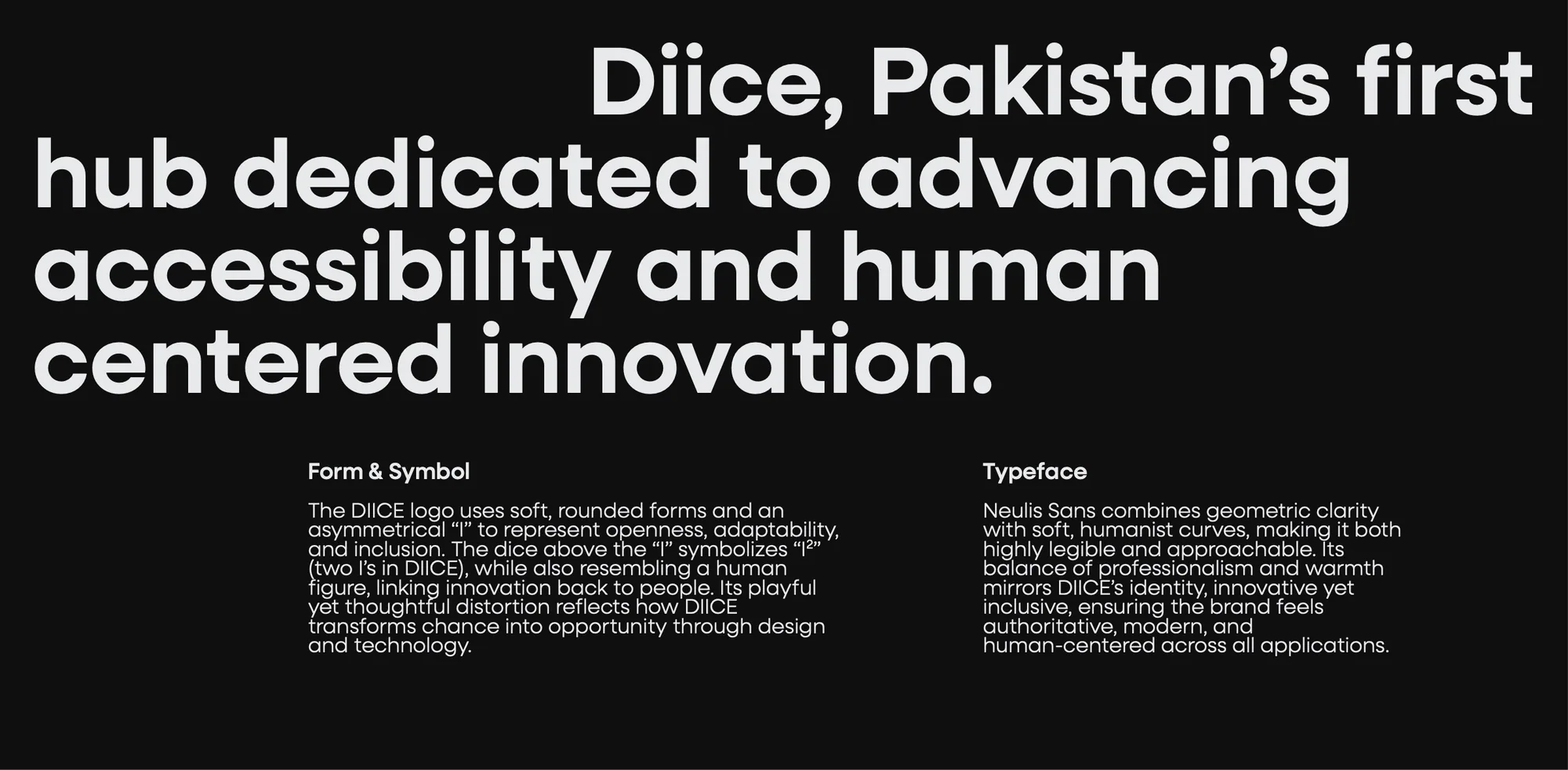
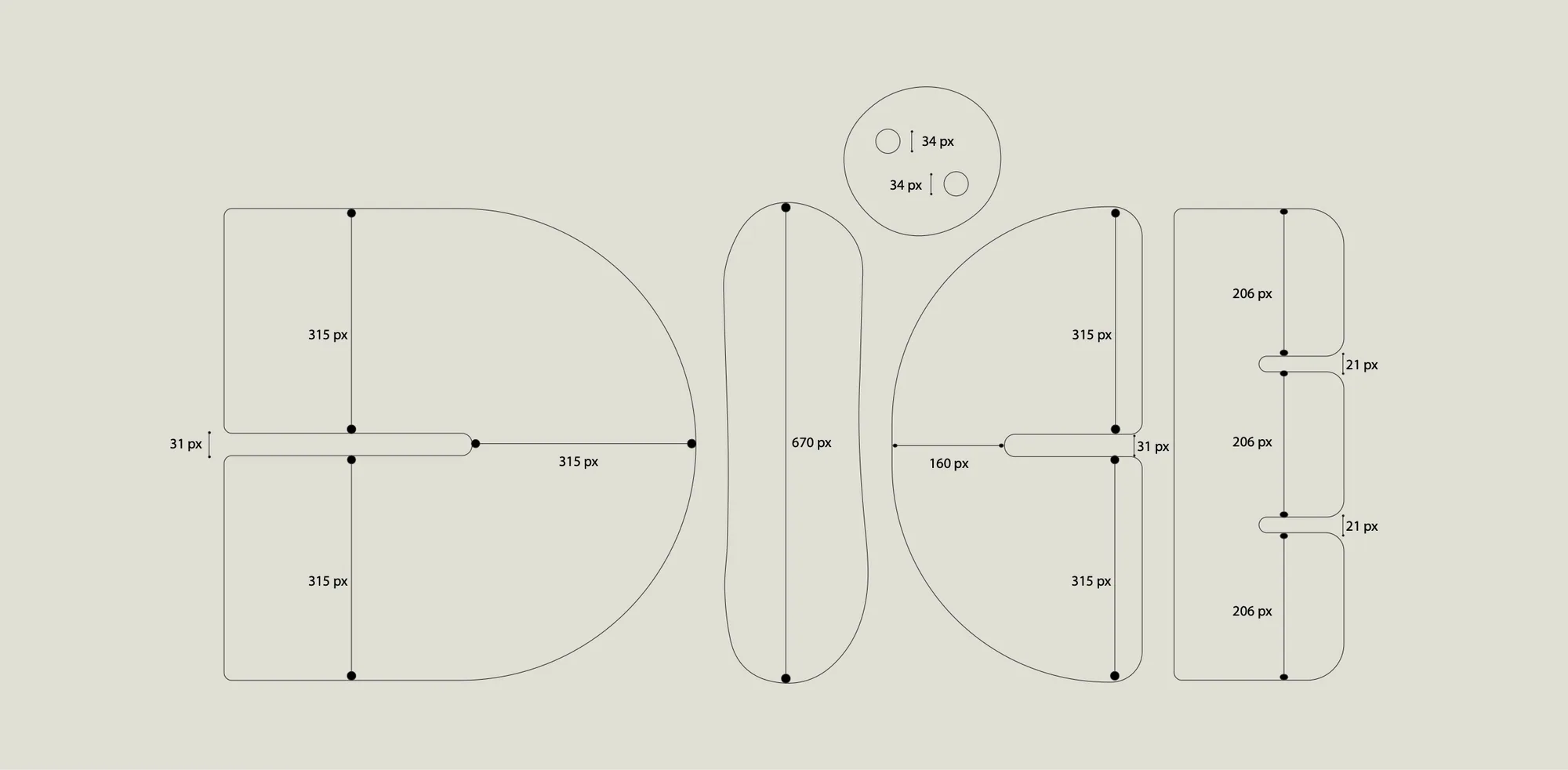
The logo uses soft, rounded forms and an asymmetrical I to stand for openness, adaptability and inclusion. The die above the I stands for I² (the two I’s in DIICE), and it also reads as a person, linking innovation back to people. Its playful but considered distortion reflects how the centre turns chance into opportunity through design and technology.
Explorations
The mark took many routes before the die: a four-petal figure, a person drawn from circles, abstract rings of dots, and the letters themselves in heavier and lighter cuts. Select any to see it full screen.
Typography
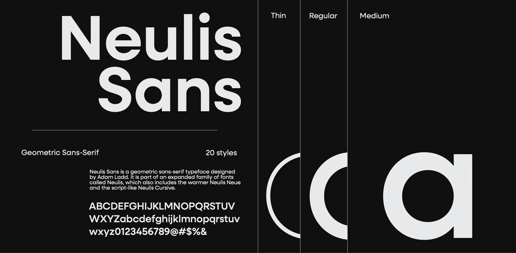
Neulis Sans, a geometric sans-serif by Adam Ladd, combines geometric clarity with soft, humanist curves, so it’s both highly legible and approachable. Its balance of professionalism and warmth mirrors the identity: innovative yet inclusive, authoritative, modern and human-centred.
Colour
Calm greys carry the identity; Periwinkle and Rose Pompadour bring it warmth. This page is set in the same colours.
- Charcoal#404E5C
- Anti-Flash White#E8E9EB
- Periwinkle#B7C3F3
- Payne’s Gray#4F6272
- Rose Pompadour#DD7596
- Onyx#313638
In use
Also at CHISEL
At the lab I also designed website UI, digital assets and data visualisations communicating research on VR for memory recognition and on early digital interventions for children with dyslexia and autism, with a focus on accessibility. I designed the marketing for the 4th Allied Bank Fintech Hackathon and edited the Vimersive Studio showreel.