LUMSx rebrand
- Role
- Visual designer and animator, Led the rebrand end to end
- Year
- 2026
- Client
- LUMSx, Lahore University of Management Sciences
- Scope
- Brand strategy and guidelines, Logo lockup and wordmark, Colour palette, Shape language and pattern system, Type system with Urdu script support, Illustration style, Social templates, Out-of-home concepts, Merchandise, Website and app concepts, Presentation system
A new identity for LUMSx, the online learning gateway of the Lahore University of Management Sciences. I led it end to end, from the brand strategy, guidelines and a type system that sets Urdu and English as equals to posters, social templates, decks and merchandise.
The brief
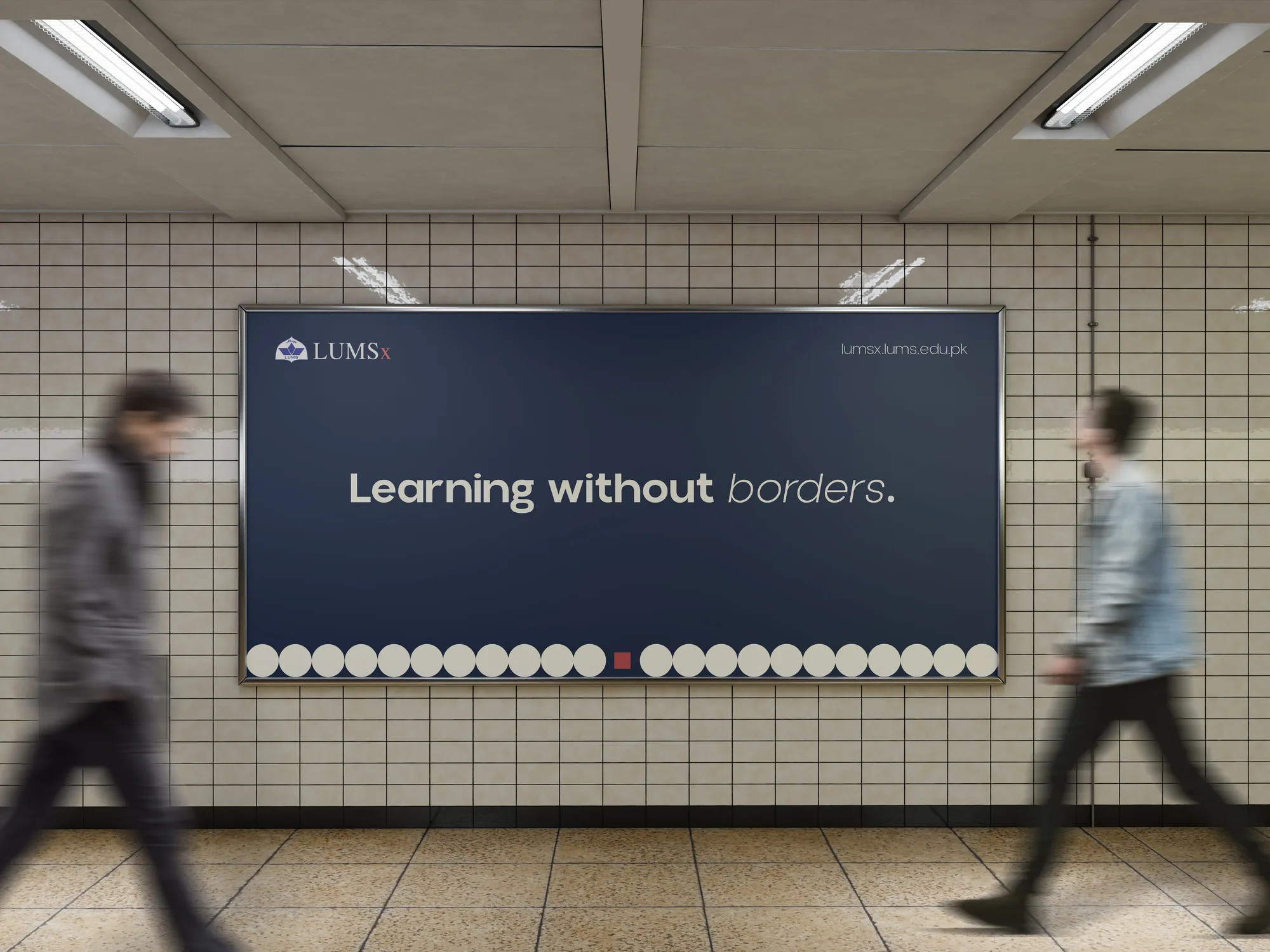
LUMSx is the online learning gateway of the Lahore University of Management Sciences. It takes LUMS teaching past the campus walls, to learners across Pakistan, the Pakistani diaspora and beyond, past every border of time, cost, location and language.
Its mission is to make world-class education a public good rather than a privilege: free, high-quality courses open to all, grounded in Pakistani realities and taught in Urdu and English, with regional languages to follow.
LUMSx needed an identity of its own. It had to be distinct from the university while carrying four decades of its reputation, stretch from a course card to a billboard, and work in two scripts.
The guidelines had to state the mission, values and persona clearly enough to guide every brand artefact that followed, including the ones other people would make.
I was Visual designer and animator at LUMSx from February to August 2026 and led the rebrand end to end: the strategy and guidelines, the identity, and its rollout across print, out-of-home, social, web and merchandise. I also designed the director deck that made the case for it, covering strategy, colour, type, shape and audience impact.
The mark
The wordmark carries the university; the x carries the extension, taking LUMS teaching beyond the campus. Emblem, name and x lock up as one, with an exclusion zone that keeps room around it, in navy on paper and in paper on navy.
Typography
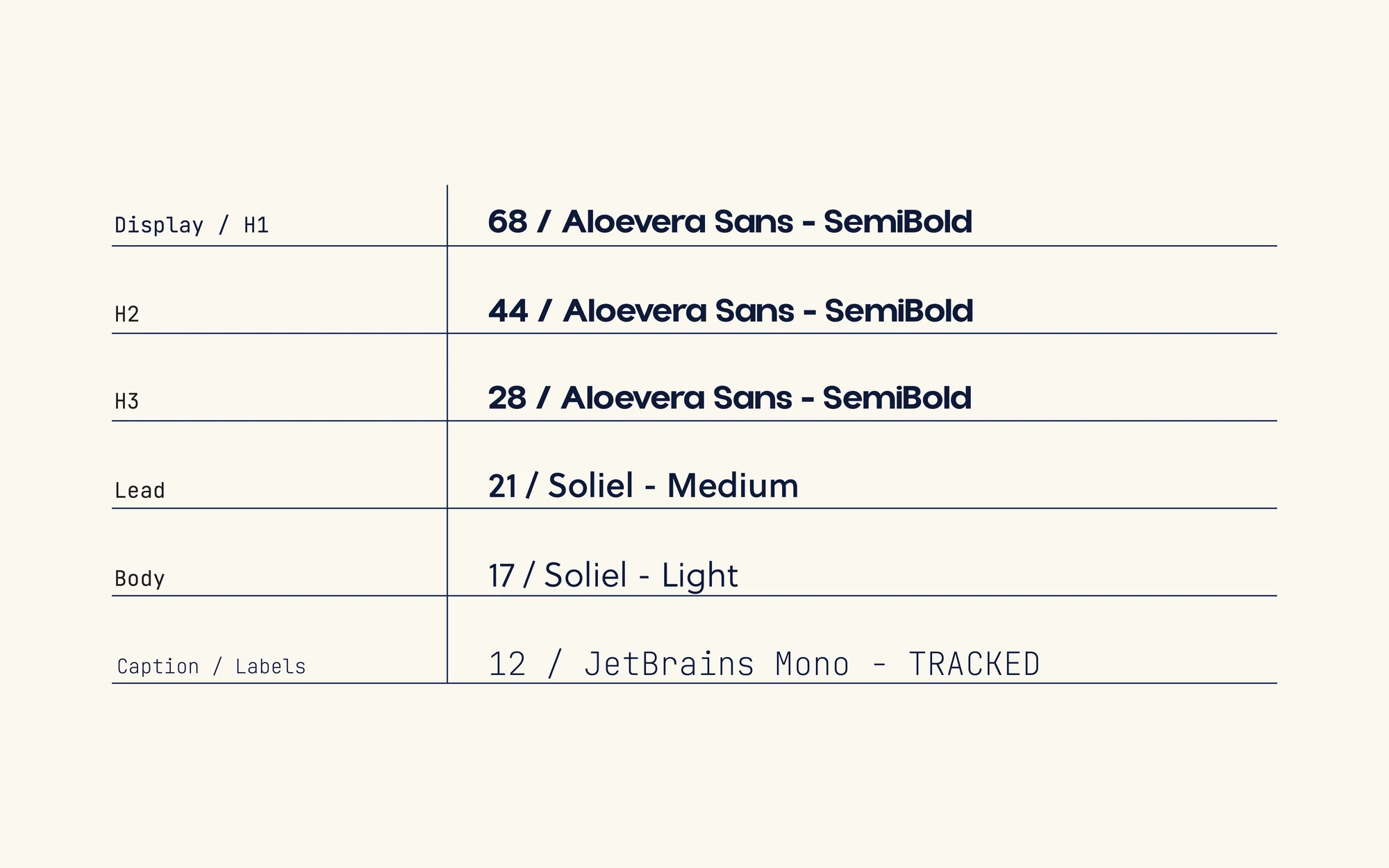
Aloevera Sans sets display type: geometric structure with soft curves, minimal but approachable. Soleil brings warmth to body copy. JetBrains Mono gives labels, eyebrows and data a precise, engineered voice.
Harmattan carries all Urdu text on the same modular scale as the Latin type, a 1.25 ratio running from 12 to 68, so the two scripts sit as equals rather than one translating the other.
Colour
Ink Navy, Deep Red and Deep Marigold lead. Indigo and Beacon Blue support them, and Shadow Gray and Paper hold the page. Each primary also comes in tints at 80, 60, 40 and 20 per cent. This page is set in them.
- Ink Navy#0F1A38Primary
- Deep Red#A21014Primary
- Deep Marigold#FF9F03Primary
- Indigo#2D318FSecondary
- Beacon Blue#2D5BFFSecondary
- Shadow Gray#242124Neutral
- Paper#FBF7F0Neutral
Brand values
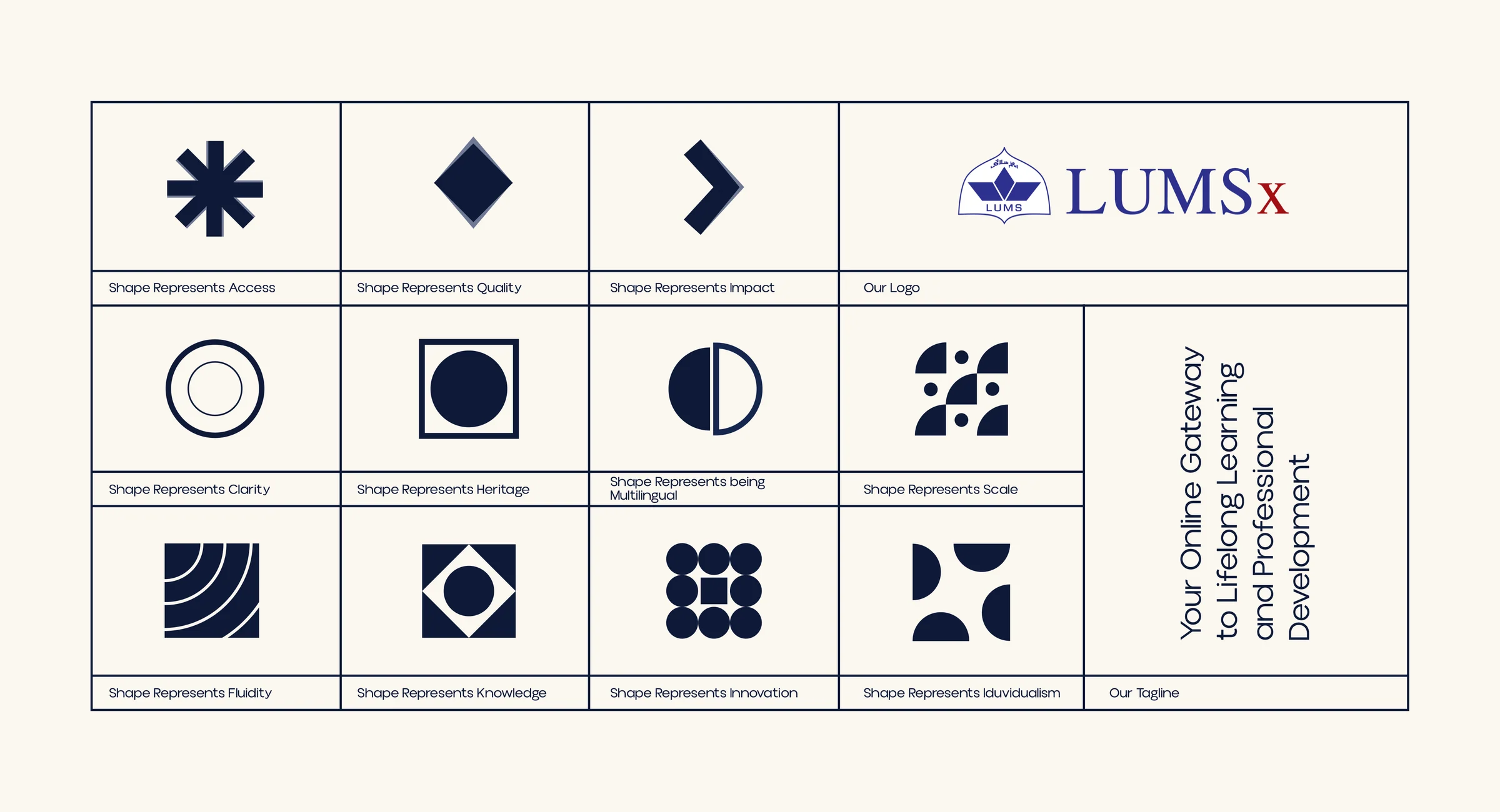
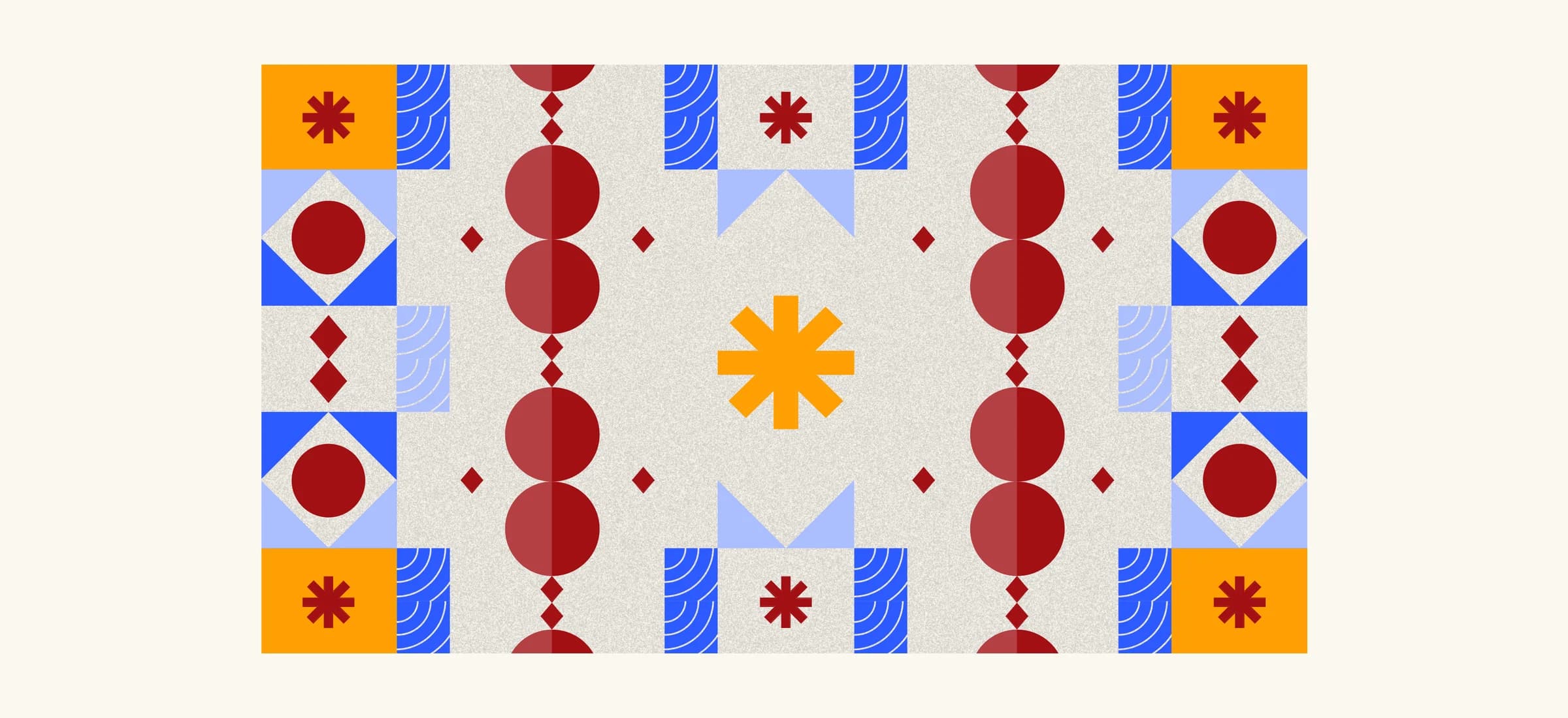
The mission isn’t only written down; the brand’s shapes carry it. Eleven shapes each stand for a value: access, quality, impact, clarity, heritage, being multilingual, scale, fluidity, knowledge, innovation and individuality. They sit beside the logo and the tagline, “Your Online Gateway to Lifelong Learning and Professional Development”.
The pattern system built from them is generative: every composition is curated to suit its subject, format and tone.
Illustration
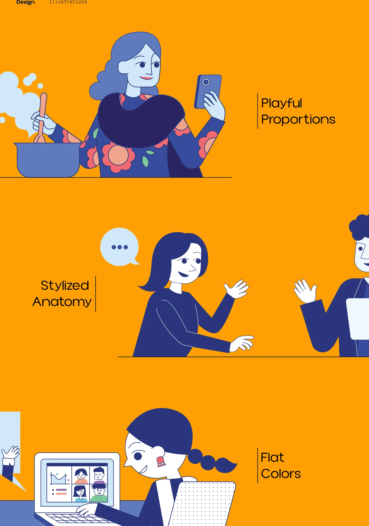
People are drawn with playful proportions, stylised anatomy and flat colour from the palette, so courses can show learners and instructors without stock photography.
Out of home
Print and merchandise
Social posts
Templates that scale from course launches and instructor introductions to hiring posts and campaign lines.
Web and app
Presentation system
A master pitch template, so every LUMSx deck starts from the system: title, section, quote, comparison, data and a closing call to action.
Course art direction
Alongside the rebrand I art directed online courses, including Prompt Engineering Essentials, Intro to Python and Entrepreneurship 101, working with faculty on course cards, banners, motion graphics and on-camera styling.
Outcome
The system rolled out across print and digital: an editorial poster series, social media templates, billboard concepts, and merchandise including mugs, tumblers, bookmarks and a corporate gift box, all from one set of guidelines that holds in English and Urdu.